Just a few years ago, infographics seemed to be the hottest type of content online. Lately, the shine has worn off as bad infographics inundated the internet.
High-quality infographics still can rise up from the flood of drivel. Infographics are not inherently bad. When infographics are designed well they simplify complex information and can make boring topics interesting.
Eye-catching visuals aren’t enough. Infographics need to have these other traits in order to be more than eye candy. The best infographics:
- Are accurate. This may seem like it goes without saying, but there are plenty of misleading infographics out there. Use infographics to reach people with the information they need to know and to make that information easier to understand. People should be more informed and less confused as a result of your infographic.
- Are in easily shareable format(s). Infographics should be viewable on mobile devices and shareable on social media. If you must publish it as a PDF (and really, must you?), also offer a JPG or PNG version, which can easily become part of a blog post, media story, tweet, or Facebook share. Without a shareable format, your infographics will probably not spread as far as they could have.
- Are accessible to all. Everyone should be able to access the information contained in an infographic, including the blind, vision impaired, and color blind. Designers need to consider color contrast, use of color, text size, and font choice. Agencies should provide a text alternative for the infographic for screen-reader users. Learn how to create an accessible infographic.
- Get to the point. The best infographics keep it simple, focusing on one main message that can inspire people to take a specific action. The design should also be easy to navigate, minimize visual clutter, and should include as little text as possible.
Here are five eye-catching government-made infographics that stand out from the rest:
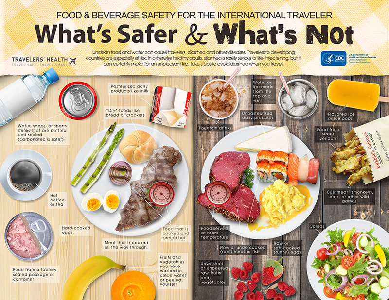
CDC: What’s Safer and What’s Not
When it comes to infographics, few agencies produce them as often as the Centers for Disease Control (CDC). More doesn’t necessarily mean better, but the CDC’s extensive experience with infographics has helped them create some remarkable examples.
Foodborne illness is a major problem for travelers. This infographic for international travel food and drink safety breaks the mold, using real photos to eliminate any ambiguity. The website that hosts the infographic includes a text description so the tips are accessible to people who can’t see images.
DOE: The Financial Aid Process
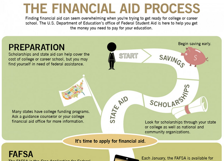
The Department of Education (DOE)’s office of Federal Student Aid uses a clever infographic to clarify the complex process of finding federal student aid. The design leads down a path that shows each step, looking like the board game Chutes and Ladders.
Thousands of people have seen the DOE’s infographics in part because it designs and shares them using Visual.ly, a site that gives users a choice between using a tool to make infographics themselves or a searching a marketplace of professional designers for hire. Visual.ly integrates with social sharing, so these infographics can spread to audiences beyond those that the DOE already reaches.
One drawback to the Visual.ly system is that the infographics are not accompanied by descriptive text, making the information inaccessible to people who can’t see the image.
FAA: Portable Electronics on Planes
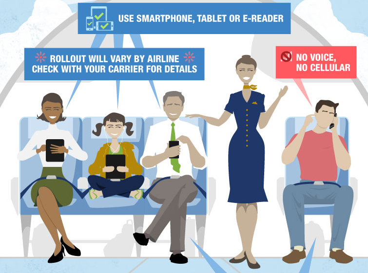
In an effort to make flying the not-always friendly skies a little friendlier, the Federal Aviation Administration (FAA) created a cute infographic about the proper use of electronic devices on airplanes.
The design shines in this example of eye-catching infographics. Thanks to a smart use of color and icons, it’s clear which electronics are and aren’t allowed while in flight. Happy avatars of people make the rules seem like a pleasure to follow. On the website, on‑page text ensures accessibility.
Why haven’t I seen this in the seatback pocket of an airplane?
JPL: 3D Interior of the Moon
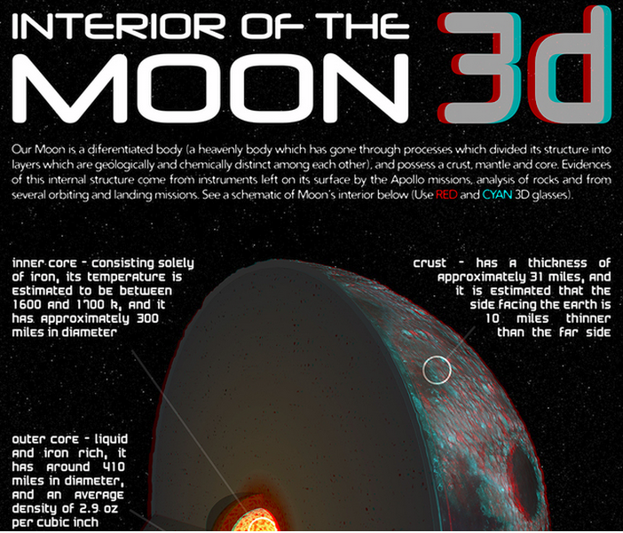
Get out those 3D glasses you’ve been holding on to since the premier of Avatar. NASA’s Jet Propulsion Laboratory (JPL) has a 3D infographic that peeks under the Moon’s surface.
Once you look beyond the 3D, there are some design flaws with the less pictorial parts of this infographic—some text is fuzzy and hard to read, and the word spacing in other text areas would drive a typographer mad. But, it’s hard to argue how the power of 3D makes this a fun, memorable design.
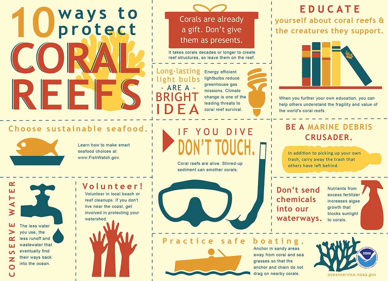
NOAA: 10 Ways to Protect Coral Reefs
The National Oceanic and Atmospheric Administration (NOAA)’s Ocean Service is on a mission to protect America’s oceans and coasts. To help get the people involved, the Ocean Service has created many infographics aimed at educating people about conservation, environmental pollution, tides, and more.
This infographic lets people know that, even if they live far from the coast, they can make a difference in protecting coral reefs. The result is a highly organized, colorful infographic that skips the guilt trip, instead using positive messages to inspire people to take action.
Has an impressive infographic caught your eye? Share it in the comments below.
Lauren Girardin is a marketing and communications consultant, writer, and trainer. Find her on Twitter at @girardinl.
Header image based on Creative Commons graphic by David Matthew Parker.


Lauren, I like your point about using a shareable format. I always hope to see and use infographics in a version other than a PDF. I do like to post infographics elsewhere, and not everyone wants to open a PDF, especially when they’re on mobile devices and using precious bandwidth.
Thanks for the tips!
You’re welcome, Angela. That’s a great point about mobile audiences. Some people may have a mobile device or a cell plan that makes downloading a PDF difficult or impossible. If you want people to share your infographic, design it so that it’s easy to view and share.