
Data visualizations are crucial to sharing the results of quantitative work. Ideally, they should help your audience understand your findings quicker, like a power-assisted bicycle. However, most of us are not trained in data visualization best practices and it can be difficult to know what type of chart to choose. To make things even more difficult, common data visualization programs provide tons of chart options, with little to no context on when or how you should use them.

Google Sheets (top) and Microsoft Excel (bottom) offer a lot of data visualization options, but no guidance on how to use them.
Many resources on data visualization best practices are also long and not beginner-friendly. For people who are curious about data visualization but do not have time to read a data science tome, here are three basic pitfalls to avoid when making visuals.
1. Short Axis Ranges
When visualizing findings, it’s common to draw attention to your most interesting insights. If this is done by shortening an axis range, the result can unintentionally be misleading. Most people assume that axis scales start at zero. As data communicators, we want to work with human perception patterns, not against them. Let’s look at an example — the two charts below both show a (fictitious) case of grades on three tests. Both charts show the same numbers (70% on Test 1, 85% on the Mid Term, and 75% on the Final Exam). But without further context, the chart on the right exaggerates the change in grades more than the one on the left due to its shortened range (60%-90%). It may seem helpful to shorten ranges to focus on the relevant groups of numbers, but zooming in like this can result in your audience misinterpreting the magnitude of your results.
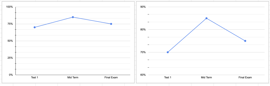
My suggestion: If you’re working with percentages, use 0-100%. If you’re working with numerical data, you can usually start at 0 and end with your highest value. If you’re working with a dataset that has very large numbers (for example, 20,000-1,000,000), this may be a case for a scale that does not start at 0, but I still recommend making the axis labels prominent and easy to read.
2. 3D Charts
3D charts can look visually stunning, but don’t really offer any advantage over their 2D counterparts. Conversely, 3D charts can make differences between data points look larger than they are or harder to interpret (see Keiran Healy’s Data Visualization: A Practical Introduction for a deeper explanation on human visual perception patterns). If our goal with visuals is to help our audience understand our results, we want to avoid leading them to the wrong conclusion at a glance.
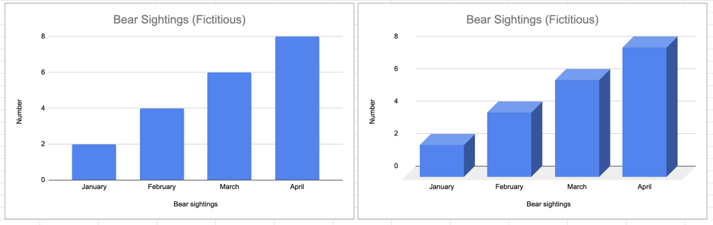
In our fictitious example below, we have a 2D chart (left) and 3D chart (right) showing the same data. However, the 3D chart plays some visual tricks on its viewer since the columns are larger and it’s more difficult to immediately match the value to the column. The 3D column isn’t adding anything novel when reporting these bear sightings compared to the 2D chart.
My suggestion: Just say no to 3D charts.
3. Pie Charts
If you visit any online data science forums, you will likely see people raving against pie charts. Many data experts argue that they should never be used while others suggest using them sparingly. Why all the hate for pie charts?
Two primary arguments against pie charts are (1) they take up more space than other charts and (2) they are only intuitive when there are a few categories being compared (see this article for a shortened summary of why data experts dislike pie charts). Ignoring the large footprint of pie charts for the sake of this article, let’s continue with our goal of communicating results clearly. Unless the data we are visualizing has “easy” proportions (think 25%, 50%, 90%), it’s harder for humans to interpret differences between data points in circular format than in rectangular format. Let’s look at a couple examples. In this first pie chart, we are only comparing 4 categories and their values differ from each other in increments of 5 (10%, 15%, 25%, 50%). At a glance, it’s clear that poodles represent half of all dog breeds, Labradors represent a quarter, and the remaining two breeds split the remaining quarter at a similar proportion. If someone looked at this graph and walked away knowing that poodles were the most common breed at the show and represented half of all dog breeds, that would be correct.
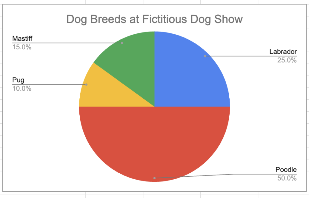
A simple pie chart showing dog breeds at a fictitious dog show
Sadly, most datasets are more complicated than our example above. Let’s say the dog show had more breeds and the percentages weren’t so “clean”. Our pie chart becomes unwieldy and difficult to parse (even with data labels!) compared to a bar chart with the same values. In the pie chart, it’s difficult to tell which category has the highest value or how large the differences between the categories are. In the bar chart, the data labels create a vertical list, allowing the viewer to quickly ingest the values without doing geometry.
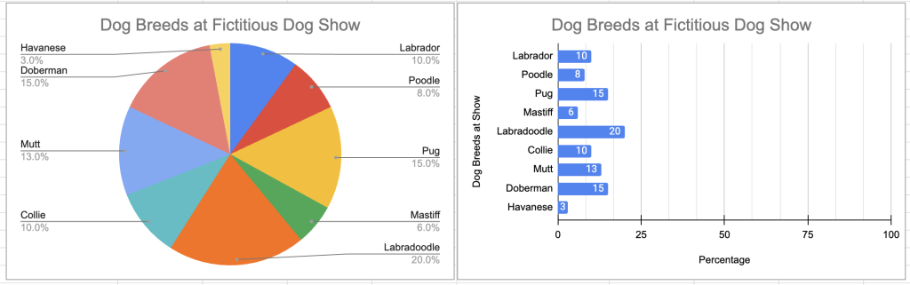
A pie chart and bar chart showing the same values
My suggestion: When in doubt, use a bar chart.
Data visualization is creative, difficult, and evolving. There is no singular correct way to visualize your data, but there are ways that work in tandem with human perception patterns more than others. I encourage folks to further explore data visualization principles, as the suggestions here are by no means the final authority on which chart to choose.
Ann Aly (pronounced like Ali) is a UX and civic tech practice leader with a background in academic research, music, and education. She combines these experiences to lead teams improving federal government services, emphasizing communal leadership and transparency. Ann holds a PhD and MA (both in Linguistics) from UCLA, and an MA (Spanish and Portuguese) and BA (Music) from Florida State University. When she’s not asking too many questions, Ann enjoys woodworking, gardening, and exploring the Shenandoah Valley woodlands near her home.


Leave a Reply
You must be logged in to post a comment.