PowerPoint has become the default presentation tool and in its ubiquitous use, it’s also turned into something we all dread. Having to sit and listen to someone present via PowerPoint usually means the following: Worst case scenario is that the presenter cycles through a series of slides and reads off the content. Slides aren’t engaging and as an audience member, you could’ve gotten all the information simply by reading the slide deck. Best case scenario is a short, concise and engaging presentation where you feel as though you learned something. The key difference between the two scenarios is that in the best case scenario, PowerPoint is used for what it was meant to be: a tool to deliver the presentation. It’s one of many things that make the presentation successful. It’s not the end in and of itself.
How can we get there? I’ll outline a few key points to keep in mind as you’re putting your next presentation together. This is in full recognition of the fact that many of us work in large organizations where we need to follow templates and protocols for presentations and where we need to be mindful of inclusivity and ensure that our work is compliant on a number of fronts, for example, ADA compliance. However, even within those parameters, we can take certain measures to ensure that our presentations are engaging.
- Don’t assume the number of slides dictates how long your presentation will be. It doesn’t matter how many slides your presentation has as long as you can go through them seamlessly in the amount of time you’ve allocated for your presentation. You can have ten slides with an immense amount of text or 30 slides with sparse text on each. My recommendation: choose the latter option. Why? See below.
- Aim for one idea per slide. You’re most likely presenting something the audience is not familiar with. For that reason, you need to give the audience some time to acclimate to your content. Moving through one idea at a time allows you audience to easily digest your content instead of overwhelming them. Separately, if an audience member is reading your slides, they aren’t paying attention to what you’re saying.
- Images, images, images! There is a lot of truth to the saying, “A picture says a thousand words.” Use this to your advantage! Find images that speak to what you’re saying and put them into your presentation. This will help the audience connect your content visually with your presentation, something especially critical for the visual learners in the crowd.
- Use your space: Don’t restrict yourself to the image boxes in PowerPoint templates. If you can (barring content constraints), enlarge your images to cover the entire slide. This makes them more impactful.
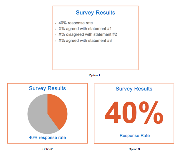
- Visualize numbers: Along the lines of using images, add charts and graphs where you can. Show, don’t tell is the rule here. If you’re talking about 40% completion of a survey, show that to us in a pie chart. You can also play with font sizes and colors: make the “40%” stand out. See the examples below.

- Give yourself time: Putting an effective presentation together, whether in PowerPoint or elsewhere, requires time and thought. Make sure to allow for that. Anticipate running through drafts with friends and colleagues to ensure that your point gets across.
What other ways do you make your presentations successful? Please share below! And be sure to check out the following books on effective presentations: How to Design TED Worthy Presentation Slides: Presentation Design Principles from the best TED Talks, and The Non-Designer’s Design Book. The post above is a compilation of my own strategies as well as ideas pulled from these books.


Thanks for this piece. It’s so simple. I’m guilty of having the power point be the presentation. No more.
Thanks for the feedback, Karen. I think we’ve all been guilty of leading the presentation with a PowerPoint (I know I have). That’s why I find it helpful to have some of these thoughts jotted down so that I can remember to step away from the PowerPoint as a starting point.
I’ve heard that a very general rule of thumb is to limit each slide to no more than six lines, and each presentation to no more than six slides. A six-slide limit would be tough, though, with complicated presentations.