I have previously outlined some thoughts an experiences related to Digital Divide issue s in my community and my observations and thoughts on steps the community and to an extent, the government can take to overcome these issues. I am firmly in the camp where I believe Digital Divide issues are getting worse, and something needs to be done to actively counter act this trend. These issues have the potential to damage America’s global competitiveness, the capabilities of the American workforce, and also cause day to day challenges in making our government more efficient. See my previous posts here and here.
I went to my volunteering session today at our local library like every weekend. My customer today was a young-middle aged man, who was adept at basic computer usage and skills. He knew how to access the internet and perform searches using Google. But his computer skills were still very basic. He did not know how to use MS Word, how to save and retrieve documents, how to create online accounts, etc.
This is a far cry from the average week where most learners have never sat down in front of a computer before. When I asked what specifically he was interested in help with, he told me his story. Seems this gentleman had recently moved to the area from Ohio, was jobless and had a history of incarceration. He was working towards turning his life around, and was applying for Fairfax county section 8 housing. He also indicated that he had contacted the county, and was told that section 8 housing application can only be submitted online. He needed help in filling out his application. Now lets take a moment to deliberate:
- First, I have no way to verify his statement that Section 8 housing application for Fairfax county can only be submitted online. If I am wrong, then please correct me. I can only take his word for it.
- As outlined in my previous post, wealth is the key determinator of access to computers and the internet and the root cause of digital divide. Section 8 housing applicants, by definition, are on the very bottom rung of the wealth ladder. Many are displaced, have overcome severe challenges in their pasts, have a history of incarceration, homelessness, or foster care. All in all, I think its safe to assume that this group does not have ready and seamless access to computers and online resources, and many do not possess the skills necessary to navigate a complex application online.
- As I helped this gentleman through his application process, I realized how frustrating and confusing the online application created by Fairfax county was. Specifically:
a) The gentleman was seeking “fairfax county section 8 application”. Section 8 housing is a fairly common name for state/city assisted hosting programs. However, Fairfax county calls its program “Rental program”. For about 15-20 minutes, the gentleman struggled to find out where to look for what he was seeking
b) Once we found the URL for the Fairfax County Housing Authority, the gentleman spend another 5-10 minutes figuring out that “Fairfax County Rental Programs (FCRP) is the link that he is actually looking for. It also doesn’t help that the Housing authority website is fairly rich and complex, which was way overwhelming for a novice computer user. (screen shot included)
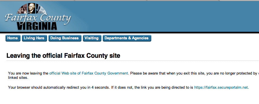
c) As you click on “Fill out your application”, the website throws up a cautionary page warning that “You are leaving the Official Fairfax County Site”. The reason behind it is that the site is redirecting you to the secure CMS system where the application forms exist, but this causes a heck of a lot of confusion for computer novices (what does that mean? I dont want to leave the Fairfax county site… Where is it taking me?… HELP!). If the CMS system target is also a county system, why is this warning necessary?
d) You are then redirected to the County’s CMS system, with a completely different look and feel. causing further confusion as the user tries to reacquaint themselves. Never mind the fact that the CMS does not work on either Internet Explorer 6 or on Safari. It required assistance from the library tech support to access it via Internet Explorer 7. Of course, there is no warning for other browsers. It just doesn’t work.
e) The forms within the CMS system were confusing and ill designed. Design elements were not consistent (sometimes the required field names are red, sometimes they have asterisks in front, sometimes they are red asterisks, sometimes they are brown, etc. The drop down labelled “Ethnicity” has two values: “Hispanic and Non-Hispanic”. If this is a valid question, shouldn’t this be a check box? etc. (all values in the screen shot are made up)
4. I also realized that regardless of how easy to use the online process may or may not be, this is an example of a process that inherently requires a person to person interaction. Applicants have several natural questions that require an answer. There are many, many exception scenarios that must be considered, such as:
-
- What if I don’t have a permanent address? It says its required.
- What is I dont have a phone number. It says its required.
- I currently live out of state, but will be moving here. This option doesnt exist in the drop down
- Of the housing options available, what are the addresses? Can I specify a preference to be near public transportation? in a particular part of the county?
- What are the eligibility criteria? Will I get automatically rejected if I have no income? too much income? How much is too much?
After struggling with it for an hour or so, the gentleman had to “Save his application” because he needed to talk to someone at the county to get some information before finishing his application. I hope he can figure out how to login and access his partially completed application on his own when he starts it again.
I want to make it absolutely clear that my comments here are in no way a criticism towards the great work that Fairfax County is doing to enable and support its residents and taxpayers. Fairfax County government is highly progressive, and Fairfax county government web portal is the 2009 “Best of the Web” winner. I think the issues outlined here can be experienced within most federal/state/local government websites across the nation.
Witnessing this process today re-inforced a couple of things for me:
1) Public sector organizations really have to think long and hard before going “online only” for core services. I have nothing against moving core service processes online. There is certainly a strong case to be made for efficiencies, cost savings and even convenience for certain customers/end users. However, sometimes, its just better to be able to go in and talk to someone and walk through the process with them. This may be a good example of that. The demographic using this process is probably not adept to figuring out an online application process. So how can we make such a process better?
a) Make sure that some level of in-person processing capability exists. If costs savings are critical, the in-person capability can be dialed way down (by appointment only, waiting list, limited weekly hours, etc.) similar to how USCIS offers in-person services to immigration applicants. You have to reserve an appointment by calling ahead. There are limited hours/days of operations, etc. But this is important for those who just simply cannot figure out the online channels, are disabled, or have questions that require a human answer
b) Offer an online chat or help desk option whereby people can call in to ask specific questions about the process if they get stuck filling out the form.
c) Offer the ability for people to send in OCR capable structured paper forms. The UK government, the IRS and many others have been using this mechanism for decades. It would still save costs. Even though this involves paper, there is very little manual intervention required with modern OCR tools to be able to capture the information into the back-end CMS. Processing can also occur (out of band) one day a week, during weekends, or can be outsourced to save costs. You can even assign a nominal fee ($5 per application) to cover operating expenses for this option.
2) There is really a lot that can be said and done about web accessibility, design and usability. Many, many organizations are not very good at it. It causes simple things to get complicated, and causes real frustration for novice end users. There needs to be better professional certification and training for this skill/art form, and organizations need to involve experts during the system design phase of all web projects. There is really no excuse for it. In most cases, we can do better.
What are your thoughts? What is your organization/agency/jurisdiction doing to address these issues? What else can be done to help things in this area?


Great post that walks the provider through the experience of a real-life user of the website. I’ve started reading a great book called “Don’t Make Me Think: A Common Sense Approach to Web Usability“. I would definitely recommend it for those in charge of developing government websites.
I also just sat in on an informal focus group for the redesign of the Stafford County, VA website. I’m going to share this post with them as food for thought. There has to be a balance between making a site “pretty” and making it “functional”. It’s a good idea to involve a diverse group of end users in testing and provide an easy way to give feedback about the site (that is monitored regularly).
Thanks for your feedback Heather. Glad my post was useful for you. Good luck on the panel and if there is anything I can do to help, please ask. Also, @sarahbourne is a guru when it comes to web accessibility. She works for the commonwealth of MA. you may want to connect with her as well.
You’re very welcome Sonny! Thanks for the tip to connect more with Sarah. Also to follow up on my feedback, came across the Army Civilian Service site recently launched and I really like the “help us make our site better for you!” button front and center. Personally I’d add a fill-in the blank line after the “other” option on Question 1, but it’s a great/quick little survey that allows the visitors to let you know what is or isn’t working about the site. Hopefully it is monitored and responded to. I think all sites should have a way to provide constructive feedback and help to make the site more useful.
Hi Heather. Yes I agree that is a good mechanism to get effective feedback. Although one of the issues I see is the insane fragmentation of sites, causing dilution of resources. Its hard to connect people with questions to the right site/content across multiple agencies, state/local/federal government resources and sites. I haven’t used usa.gov recently, but we need a better search engine that indexes all government resources.
Having said that, we used a similar mechanism on our cfoinfo.dc.gov site to solicit feedback, but received very very little feedback. Probably because we weren’t too successful in building engagement around the site. Also because people contacted us through other channels (phone, twitter, etc.). Its important to monitor and respond to such surveys and comments when provided. Builds engagement and loyalty. Its also important to analyze user behavior on your site (what are the top search queries, page visits, longest time spent, etc.) to continuously update the site to make the important content front and center. Sarah and her team (and many others) are experts at this type of work. I don’t pretend to know much about it.
Thanks, as always, for your feedback