I’m a huge fan of iPhoneography, so it was natural that I would enter the Fotoweek Mobile Phone Image Contest. The theme of the competition was “Fotoweek Through the Mobile Lens”:
Mobile devices allow you to get up close to capture intimate moments, abstract macros, candid street photos, night projects, and what FotoWeek DC Festival means to you this year as you walk around DC and experience all of our events.
I went to several Fotoweek shows but was so busy seeing amazing photos that I hardly took any pictures at all.
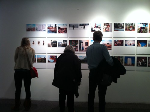
So, I decided to visit Fotoweek HQ the day before the contest ended to see if I could get a good iPhone pic for the competition. Fotoweek HQ (the old Borders on L Street) was filled with exhibits by photojournalists. My original idea was to get a photo of people enjoying the show, like this:
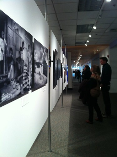
In addition to having photographs along the walls, they also had exhibits on panels in the middle of the old Borders space. The bottom part of the panel was open.
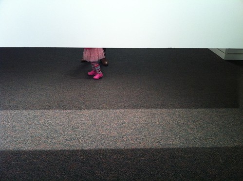
I noticed a little girl with her mom on the other side of the display. I could just see her feet, which struck me as funny and absurd. Here’s the photo I took:
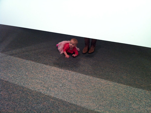
Here’s an outtake that gives you more of an idea of the context of the shot, as well as the cuteness factor.
I took about ten photos inside Fotoweek HQ of people and art. Once home, however, it was obvious that the best photo of was of the little girl’s feet – it was simple and strange.
I like Instagram and their multiplicity of filters, but didn’t use it this iPhone app. I wanted to keep the photo as simple as possible, and didn’t want it to look like it was shot with a Holga or with 1970s-era film.
Instead, I used Adobe Lightroom to crop out the distracting column, as well as making minor adjustments to the temperature, color and contrast to make it “pop”. Here’s the final result:
In the above photo you also couldn’t really tell how big she was or where the picture was taken. The white space above her feet doesn’t have much definition and is a little mysterious. This is something that appealed to the judges. It was an unusual look at Fotoweek, fitting the theme of the competition.
I have a thing for symmetry – the three sections and horizontal lines appealed to me, as well as the simplicity of the photo.
Just before the deadline, I sent in my photo. I didn’t hear anything back but went to the closing party anyway – I love looking at photographs and drinking beer. I stood at the bar and there my photo was – with First Place next to it!
Lessons Learned
- You can’t win if you don’t play. Take photos and submit them.
- Read the directions. Having been a judge myself (for screenplay contests), I knew that the contest directions and theme were important. They wanted photos of Fotoweek, not just interesting mobile photos.
- The best camera you have is the one you have with you. For many of us, that’s the iPhone.


Leave a Reply
You must be logged in to post a comment.