 The first website I ever built was in high school in a class called “Computer Programming.” It was a monstrosity that started blaring a Disturbed song on page-load (in my defense, I wore a hoodie and brooded through high school). My teacher was less than impressed with my approach. My user experience (UX) was based on the small percentage of people liking the song and the even smaller percentage appreciating being blindsided by quasi-metal, and my user interface (UI) was essentially non-existent. I wasn’t considering my user’s experience or interface at all; I was thinking about my own.
This single web-building experience would influence my approach to UX and UI over a decade later.
Fast forward to 2017. I’m tackling the Montana Motor Vehicle Division’s (MVD) website redesign, and my only experience up to this point was my high school website (granted, website-building tools have significantly improved since Disturbed was popular). My perspective on UX and UI are influenced only by my experience as a web user through the years and by what I hear customers complaining about in a field office.
Intuitively, I knew that the two traditional means of finding information, navigation bar and search bar, were not helpful to a majority of our customers. MVD’s website was primarily text down a page, so even if customers found the correct information, parsing through it was incredibly difficult. We needed something more engaging, something conversational.
I cut my teeth on the MVD website redesign, learning WordPress, Visual Composer, a myriad of other plugins and backend configurations, and of course building the state of Montana’s first government chatbot. That experience forever changed the way I look at websites.
During the redesign, I started formulating an idea about a new type of website, one that moved past the idea of a static webpage that a vast majority of the internet employs. One that was more… conversational.
Nearly a year after phase one of MVD’s website redesign, a rare opportunity presented itself. I was tasked with developing and designing the first standalone REAL ID website out of all 50 states. Honestly, it was a gamble by my administration. We have a webmaster at the Montana Department of Justice (DOJ) that they could utilize that was certainly more qualified for the job. But I digress.
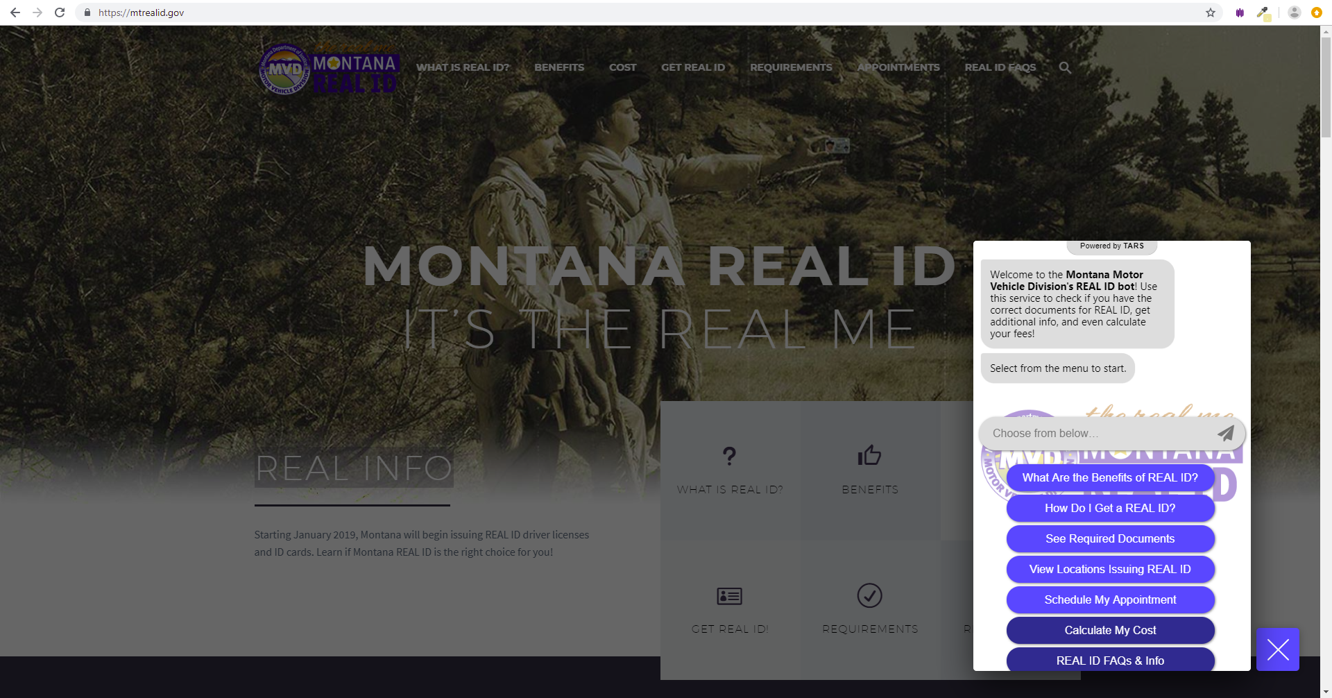
I entered the project with one goal in mind. I wanted to build (possibly the first) website that was an amalgamation of web elements and an automated conversational system (aka a chatbot). In other words, interacting with the website would launch automated conversations from a widget from specific content and/or automated services.
It took approximately two months to build both the chatbot and the website and intertwine the two. As the website formed, I realized that I was implementing a new type of website, one that wasn’t just static and stale, but a new approach dedicated to user engagement (UE).

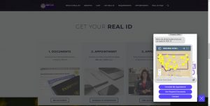
A conversational website can offer embedded Google Maps to quickly display field offices with business hours and directions.
The gamble paid off. The website, mtrealid.gov, has shattered expectations of how a government website engages users. In just three short months, the website has received rave reviews and logged over a 60 percent interaction rate with users after the chatbot was launched. Additionally, the conversational website was named as an instrumental resource in MVD’s national “Excellence in Public Engagement” award from the Coalition for a Secured Driver’s License for our REAL ID campaign. To date, just over 5,500 users have interacted with the chatbot after launch.
Some notable features:
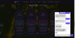
- An automated fee calculator that determines the cost of driver licenses and ID cards based on each user’s specific factors, such as age and license type (demo fee calculator)
- An automated document checklist that steps users through the appropriate documents required and even offers options for exception process if certain documents cannot be obtained (demo document checklist)
- An automated email notification sign up before appointments where available; we signed up 1,200 people into a SendGrid email marketing account and notified all with a professional email once appointments were available
- Additional information launched from specific points on the website that guided users to other services such as the automated fee calculator or appointments
- An embedded bot on our FAQ page for users to submit a question they could not find with their email to receive a timely response and influence future FAQs

The fee calculator lets users choose from 11 different licensing services to calculate their specific costs.
Though still early in its inception and considering Montana is not actively issuing REAL IDs yet, the website has proven an invaluable resource already. It is actively informing the public and providing automated services that promote transparency, trust and high customer satisfaction. So far, the chatbot has recorded an average rating of approximately 4.5 out of 5 stars with such user feedback as:
“WOW!! I had no idea we had access to such a valuable GREAT service!!! thx MT!!”
Mtrealid.gov is considered the first conversational website in government and, by the overwhelming positive response received by users, it stands as a new approach for government agencies to consider when looking to the future of citizen engagement. Just make sure you hold off on the Disturbed intro music.
Did you like this article? Follow me on LinkedIn for more content and to continue the conversation!
Levi Worts is part of the GovLoop Featured Contributor program, where we feature articles by government voices from all across the country (and world!). To see more Featured Contributor posts, click here.


That is a great article!!! Good job!