In earlier blog posts, I mentioned Govt.nz, which is the New Zealand Government’s flagship website. The new website was launched in July 2014 but things didn’t actually stop there.
That requires a little explanation: we launched a minimal viable product or MVP. If you Google that term, you’ll get either a definition that includes return-on-investment language or something along the lines of an MVP “collects the maximum amount of validated learning about customers with the least effort.” from Wikipedia.
My plain English definition is that it’s a website which meets basic user needs but is not ‘done’ in the traditional sense. In other words, we launched Govt.nz with ongoing plans to add more content, improve the information architecture and develop more functionality based on prioritized customer needs. Along the lines of: Day One – launch website; Day Two – start making it better.
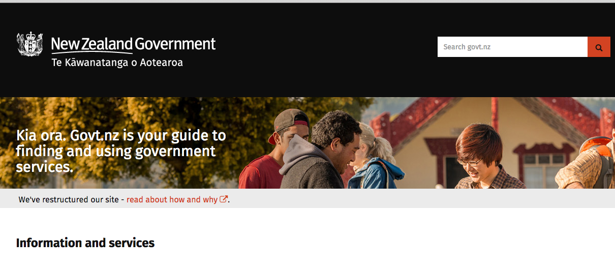
To give you some idea of the changes, the website went from:
Designed in 2007
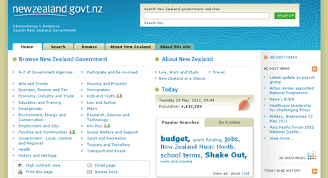
Original website design in 2007.
Launched in July 2014
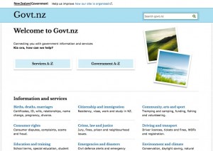
New website launched in July 2014.
Updated in February 2015
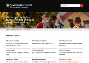
Revised website launched in February 2015.
And now, the rest of the story
So that’s a bit of context. Now let me tell you why I think we did things right in getting to this point. In a previous blog post I mentioned the 4 lessons we learned during this project, which seem like a good way to tie this all together.
Lesson 1. Don’t start from scratch. Build on what others have already done.
New Zealand is a small jurisdiction. Like other governments, New Zealand is focused on doing more with less so throwing a lot of resources at a new website wasn’t in the cards. The project team looked around and realized we weren’t the first ones to face these same issues. In the UK, Government Digital Service was already building their new government website GOV.UK; South Australia was looking at a franchise model for creating and maintaining content for www.sa.gov.au; and New South Wales, Australia was creating nsw.gov.au, a one-stop-shop for services across all channels to improve service delivery and reduce costs.
We got in touch with people in each of these countries and asked what they learned, how they did it, what they’d do differently and if they were willing to share. Wow, did they come through for us: code, advice, user testing results and support. Because of this we were able to start far ahead of the game and build on what others had already learned.
Lesson 2. Start small and iterate. Adapt as needed.
The key lesson from the private sector: the digital environment is too fluid for you to spend years designing something that’ll be archive fodder the day it’s launched. The project team used an agile approach with a focus on building an initial (or alpha) test site. We learned from that, then tossed it out. We built a second version (or beta) site, which was publicly available. We told everyone about it. We invited feedback. People commented on it. Assumptions were shattered. We picked up the pieces, did more user research and put it back together time and again.
I should clarify: the redesign covered everything. We looked at best ways to build the information architecture, color psychology, cultural identity and what was iconic to New Zealand. We set up card sorting and other exercises to find out where people expected to find information and what they wanted to know from government. We used personas developed for another initiative, added life events (births, job losses, divorces, registrations etc) to each and walked ‘them’ through getting services from government to make sure we covered all the bases. We sourced priority content from agency websites, rethought it from the user perspective, and then re-wrote it in plain English.
We combined that content into user journeys so people could see what they needed, not just the slice from Agency A without any reference to the piece of paper they had to have from Department B to take care of Registration C.
And the feedback covered everything as well. We juggled contradictory comments – too plain, too busy – with user testing results to figure out how people actually used the beta. The team gradually built a picture of what New Zealanders needed and how they wanted it presented. The beta was constantly being updated, often several times a week to push it closer to meeting our MVP needs.
Lesson 3. Share what you do even if it doesn’t work like you expected.
The project team placed a premium on being open and transparent. The user testing results were published, even though the results were sometimes not very flattering. The team blogged about what they were doing and why, even when things didn’t work. The final website includes published design principles and a content style guide so users can hold us accountable; these were included in the beta as well. There were feedback options on the beta, regular invitations to comment, lots of presentations across the public sector, and we partnered up with an independent research company for all user research to help us make sure we weren’t inadvertently skewing results.
Lesson 4. Base your decisions on evidence: user testing, feedback and more user testing.
Focusing on the end user is an idea that requires a change in perspective. It’s really easy to get caught up in making decisions based on assumptions, directives, what’s been done elsewhere, and so many other possibilities. While an environmental scan is a good starting point, you need to make sure that the choices are still valid within your own culture/ country/ circumstances before you lock yourself into a direction. We’ve used research techniques such as card sorting and tree testing to refine our information architecture. The research showed us that New Zealanders expected to find information in different places, so we made some changes and the current Govt.nz architecture reflects that feedback.
More recently, the Govt.nz team’s research reviewed a Nielsen report, which showed that low literacy substantially changes how people interact with websites. And it turns out that 40% of New Zealand’s working population have low literacy levels. This is now influencing how content is written for Govt.nz.
Wrap up
While working this way can be really uncomfortable – especially for those of us with project management backgrounds – there’s a lot to learn from the private sector and from other governments that have already been there. The digital space is just too fluid to give you time to take a brick-and-mortar approach to development.
Since people expect government to stay relevant, provide the services they expect efficiently, but not spend too much to do what businesses already offer, it seems that we’re the ones that need to adapt.
Cheers
Susan
@SusanCarchedi
www.WebToolKit.govt.nz
Susan Carchedi is part of the GovLoop Featured Blogger program, where we feature blog posts by government voices from all across the country (and world!). To see more Featured Blogger posts, click here.




I tried going to the site at work this morning, but was blocked from accessing the site, apparently because of “security certificate” issues. Can’t tell if the problem is at your end or mine. I’ll see if I can getthing a rectified on Monday.
But now that I can see it from home, kudos on a great job. You can never go wrong when your starting point is thinking about how people think, and that readily shows in the interface structure, the headings, and the (blessedly) plain language. And equally commendable, I find nothing that smacks of implicit election campaigning. The language is very much that of public servants who simply want to do what they came to government to do for the people. I like that.
Thanks Mark. I’ve passed your comment on to the Govt.nz team and I’m sure they’ll be thrilled with your feedback. I was lucky to be on the edges of their work and they truly did focus on delivering to the people who need the info.
Awesome site & great story of how was developed. I particularly love how agencies leveraging code across countries.
Hi Steve – thanks for your comment. It has been a real surprise to me that there is so much sharing going on between countries, formally and informally. I wonder if it stems from public servants wanting to create the best customer focussed solutions rather than looking for competitive advantage? The optimist in me likes that view. Cheers, Susan
All good points. I’ve been working on online maps and using an approach similar to this. Thanks for sharing!
Hi Laura, maps is such a great area for this sort of approach! I went to a GIS conference in the early 2000s and remember thinking that I didn’t realise how much you could do with maps at that point. Now with so many changes to online mapping capability plus all the data being released, it must be a very exciting field to work in. Cheers, Susan