 Shell recently released its report “Signals and Signposts,” which looks forward to 2050 and attempts to predict future energy demand, supply, roadblocks and opportunities.
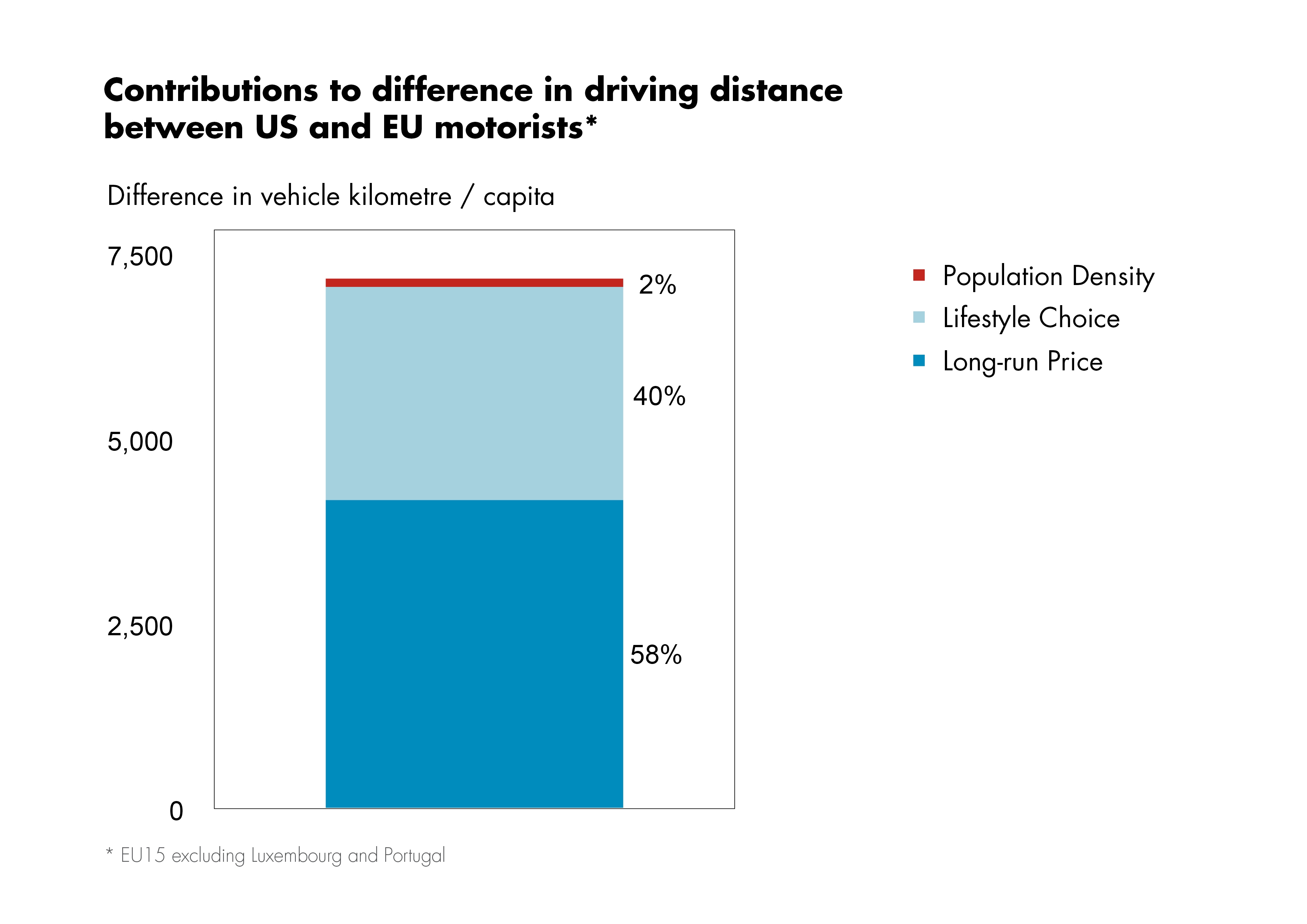
While there is a lot of fascinating reading in the report, one piece that caught our eye was this chart, which compares US and European drivers’ motivations.
Shell asked itself the question, why do Americans drive more than Europeans, on average? This graph is their boiled-down answer. The three colors show the three motivations: long-run price (dark blue), lifestyle choices (light blue), and population density (red). As the chart clearly shows, the long-term (compartively) low price of gas in the US is the single greatest factor contributing to American’s driving distances being higher than their European counterparts. Shell writes about the long-run price (dark blue) that:
The decisions which lead to the development of highly dispersed urban infrastructure – or city sprawl – are (in part) motivated by low long-run energy prices. This accounts for 60% of miles travelled
and about the population density (red):
The difference in population density contributes only very little directly and is in fact not significant according to our analysis….This result indicates that the quality of urban mobility infrastructure development can hard-wire either energy profligacy or energy efficiency into the system for decades.
So, Shell seems to say that low prices contributed to city sprawl, and that urban transit options haven’t stopped people in US cities from driving more than their average city-dewlling European counterpart.
There is a lot more to find in Shell’s report, including some predictions about the use of renewables in 2050. So be sure to check it out soon.
Photo from Signals and Signposts


Leave a Reply
You must be logged in to post a comment.