![]()
Last week, I talked about the tools and assets you need to make data-driven decisions. Today, I’ll dive in to how to use what you found.
First, let’s go back to the idea of customer-centric decisions. At the Census Bureau, we focus on our customers’ overall experience, whether it is online, through our call-centers or with our field representatives. That means we need to fully understand who our customers are, what they want and what they experience when they interact with our products and services.
To figure out how to meet our customers’ needs (including those we didn’t even know they had), the Census Bureau created an overall story using metrics. An important tool for our storytelling is our aptly named Customer Experience Management platform, or CEM.
CEM is an automated electronic dashboard that gathers metrics about our customers, from web analytics to call center stats, and weaves them together to create a visual resource – that finished jigsaw puzzle I wrote about in my last post. (You can get just as robust visualizations with Excel and staff members who are spreadsheet whizzes, though I have to warn you it’s a bit time intensive — but worth it.)
You might not think of data as raw material for storytelling, but remember, those metrics aren’t just numbers — they represent information about your customers. If you can figure out your customers’ stories, you’ll learn what you need to know to provide them with the best overall experience.
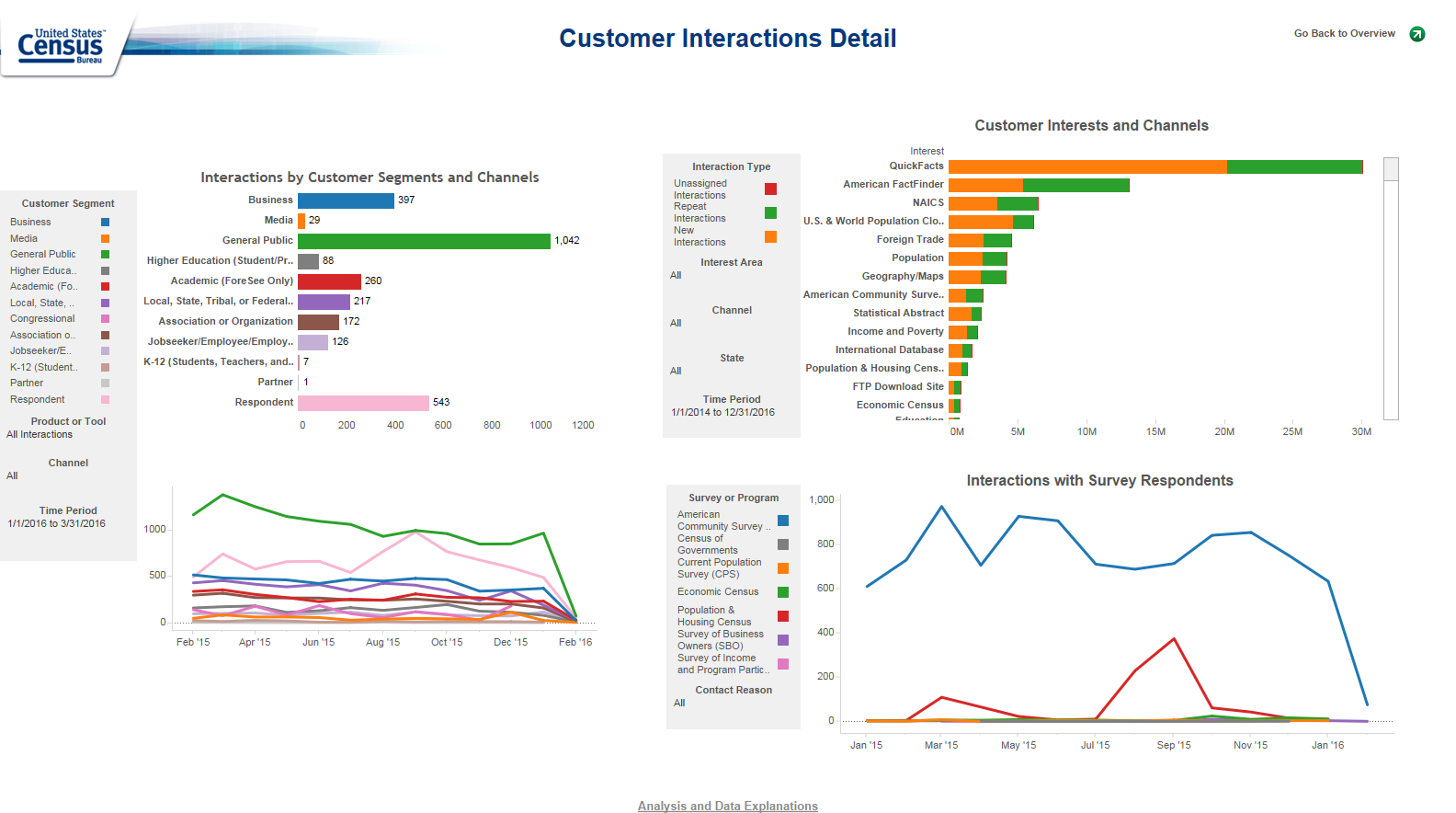
Here’s a peek at one of our recent dashboards, which gives a complete picture of our users. From these four graphs, we can easily figure out interactions by customer segment (how the general customer identifies him- or herself — for example, as a teacher or a businessperson). We can also see the most popular pages on the website and which surveys are getting the most attention or feedback. The really interesting part of these dashboards is they are what we call “cross-channel dashboards,” meaning the graphs you see represent our customers on all communication channels, whether it is through the call centers, online or in person with our field representatives.

The dashboard looks complicated, but it really can be a quick storytelling aid once you get the hang of it.
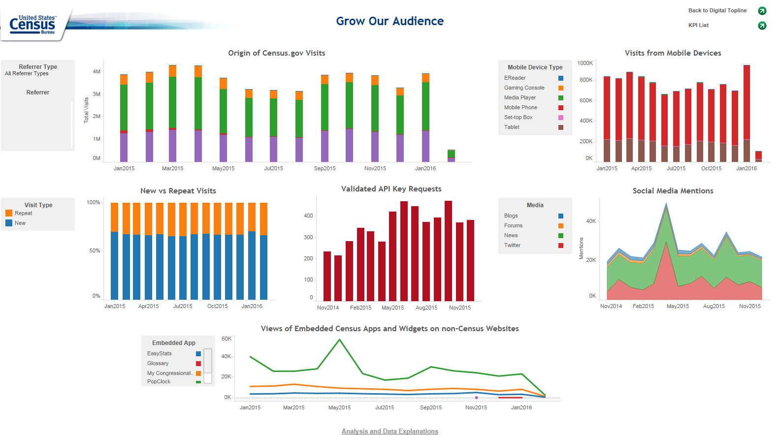
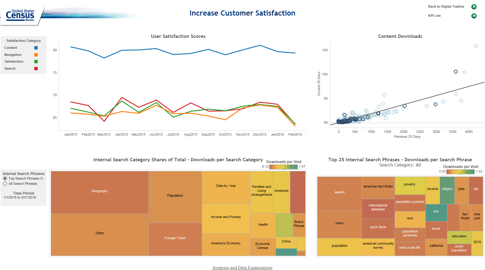
Other dashboards help us to see whether we are meeting our goals according to our Key Performance Indicators, or KPIs. From customer satisfaction rating to download rate and content interest index, we can use the information to determine whether the strategies we’ve been using are working.


So what’s the point? On Census.gov, one of our most popular pages is the Population Clock, which displays the U.S. Population and World Population projections. According to customer satisfaction surveys, a majority of our customers were happy with their interactions with the page.
Job well done. End of story, right? Because of this page’s popularity, we had an opportunity to further improve satisfaction by providing a more visual and interactive experience. Furthermore, we could keep this audience engaged on our site longer and make this popular content available through other sites to attract new customers.
We redesigned the Population Clock page, making it shareable, interactive and more graphically pleasing. Each side of the clock, whether U.S. or World, is open for customers to explore population details. With a more engaging, functional and interactive experience featuring more compelling data, the customer satisfaction rating moved from 75 to nearly 90 percent. The Population Clock experience has been shared multiple times across blogs and other sites, exposing Census Bureau content to new customers who hadn’t visited census.gov before.
We’re always on the lookout for other opportunities to gain stories from our analytics, and re-write the tale. Whether customers are satisfied or dissatisfied, whether your web numbers are up or down, there’s always a way to do things better. And there’s no better ending to a story than a happy and satisfied customer.
Stephen L. Buckner is part of the GovLoop Featured Blogger program, where we feature blog posts by government voices from all across the country (and world!). To see more Featured Blogger posts, click here.


I completely agree when you are talking about how you need to figure out your customer’s stories to provide the best customer experience. Thanks for sharing!
Really like the dashboards, especially with the focus around utilizing metrics to tell the story for your customers.
Nice write! I like how you link data with narratives. I used to think that the data presentation was the opposite of the narrative presentation. After reading your article, I have a more favorable opinion of data driven decision making; it can actually support your experiences or “gut feelings.”
You can test those “gut feelings,” hypotheses, or claims with data inquiry.
Also, finding out how reliable one’s business “sixth sense” is would be very important in building self confidence in professionals. Just like a shy student in a class may not raise his hand in class to guess at a question, a talented executive may not share his opinion in a meeting because of a lack of experience connecting data with his stories or gut feelings.
Putting data to your gut can not only enhance how well you can serve the public, but boost employee self confidence, and, therefore, better management of the company.
We may have to redefine the word “risk taker” in doing business now that we are more data driven.
I am wondering if the “safety net” of data driven decision making will encourage more people to take risks in the business world?????