Stocks started the week moving sharply lower as the Dow lost 140-points on Monday, but three days of big gains helped push the indices into positive territory for the week, despite weakness on Friday.
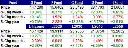
Here are the up to date TSP fund returns through June 28 and the final numbers for the month of June. The week ended with gains in all funds, while only the G-fund managed again in June. The C and S funds continue to lead the way at the half-way point of 2013, with solid double digit returns.

Those of you who read my Daily Commentary regularly will think I sound like a broken record, so this is more for our Weekly Wrap Up readers. The Dow has been on a string of triple digit moves, both up down, like we haven’t seen in quite a while.
We have now seen 4 triple digit moves in a row in the Dow. 13 in the last 14 trading days. 16 of the 20 trading days in June. And 19 triple digit moves in the last 24 days. 9 of those triple digit moves in the Dow were up, 10 were down. This is significant because volatility like this is more often seen near market tops than market bottoms.

This chart of the SPY, which is an Exchange Traded Fund (ETF) that mimics the S&P 500 (and our C-fund), shows the short-term support and resistance lines that will have some influence on market direction. There is some key overhead resistance on the chart that the S&P may have a tough time climbing back over. Getting back over them would mean the bull market is still in charge. Holding below them could be the precursor for a more serious correction, and this chart looks closer to a breakdown so it needs some help.

Chart provided courtesy of www.decisionpoint.com, analysis by TSP Talk
If you have been reading the last couple of weeks, you know that I have been dwelling on the 1987 chart comparison, which of course was a year that we had a major stock market crash. We have had a series of signals from something called the Hindenburg Omen in the last few weeks, that has a good record of going off before a major market move lower. For that reason I have been quite defensive, and in my research I found an interesting comparison between the current S&P 500 chart, and that of the 1987 chart before it crashed.
I won’t go into any more detail. I’ll just let you look at the two charts.


Chart provided courtesy of www.decisionpoint.com, analysis by TSP Talk
Crashes are very rare and I’m not saying we are going to crash, but I am playing it safe until this comparison breaks down. One way that can happen is if we see the S&P 500 move back above the resistance trend lines, and the 50-day EMA. Getting above 1650 would make me feel better.
Good luck, and thanks for reading. We will be back here next week with another TSP Wrap Up. You can read our daily market commentary at http://www.tsptalk.com/comments.html.
Tom Crowley
www.tsptalk.com
Weekly Wrap-Ups Archive
Facebook | Twitter
The legal stuff: This information is for educational purposes only! This is not advice or are commendation. We do not give investment advice. Do not act on this data. Do not buy, sell or trade the funds mentioned herein based on this information. We may trade these funds differently than discussed above. We use additional methods and strategies to determine fund positions.

Leave a Reply
You must be logged in to post a comment.