![]()
You’d think that people would know better by now than to use “Click here” for links. It’s not like they haven’t been told.
But I still see it on all the sites, all the time–commercial, entertainment, news, and–even considering Section 508–government sites of all kinds, federal, state, and city.

So I’m taking this opportunity to show you why it’s wrong.
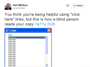
If you use “click here” for links, this is what people who use assistive devices to access websites see:
Yep. Just a giant list of click heres. No help when it comes to deciding which links to follow.
What one would you choose first? How would you keep them all straight? You couldn’t.
How to Fix
So how do you fix these click heres?
It’s easy.
Let’s say you have a sentence:
You can do it a couple of ways:
- Get a copy of our Authorized GSA Schedule Government Pricelist
- Get our Authorized GSA Schedule Government Pricelist
Although I don’t know why there’d be an unauthorized pricelist, so maybe even
- Use our GSA Schedule Government Pricelist
Or even
- GSA Schedule Government Pricelist
Check your style guide to see if there’s anything else you should do (symbols, URL/not URL, etc.)
Resources
Want more help in fixing link language?
- DigitalGov University – Plain Language and Descriptive Link Language
- Smashing Magazine – Why Your Links Should Never Say “Click Here”
- W3 Quality Assurance Tips for Webmasters
If you know another resource, please add it in the comments below.
Katherine Spivey is part of the GovLoop Featured Blogger program, where we feature blog posts by government voices from all across the country (and world!). To see more Featured Blogger posts, click here.


So helpful! Thanks for sharing!