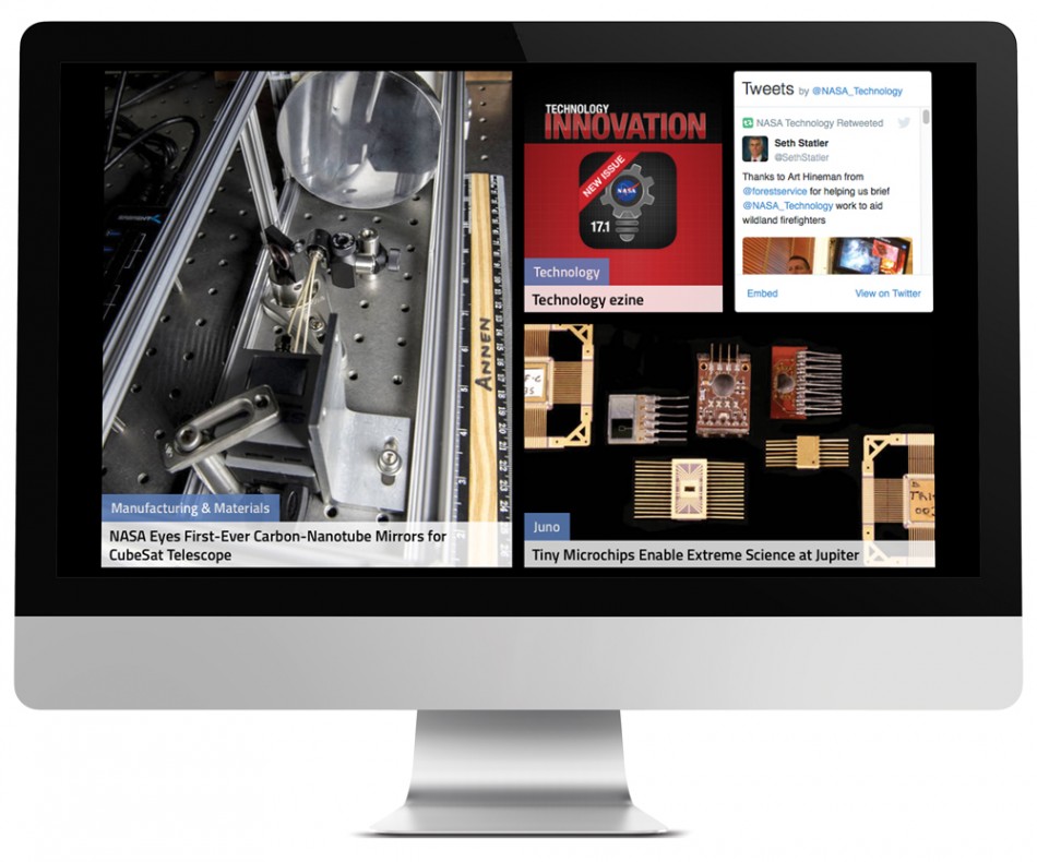
Providing important information to the public is the primary goal of most government websites. Until recently, that often meant large amounts of text, few images, and troves of hard-to-navigate information. However, advancing technology has provided agencies with a way to creatively and inventively share data with citizens without sacrificing the messages they are trying to convey. From cleaner, more accessible website layouts to using more engaging media with visitors, government websites have seen a strong growth in usability and interactivity.
OmniStudio already shared the 2015 Webby Award-winner for the government category in our post “What makes an award-winning government website successful.” Now, with the new 2016 Webby Award winners, we took a look at the ‘Government & Civil Innovation’ category to see this year’s web trends and design and development successes. The top themes for government web design that we identified are:
- Using multimedia, such as photos and videos, as a means of sharing data
- Implementing advanced web technology to increase interactivity
- Putting information at the forefront with very simplified, clean design
NASA 
The clear frontrunner this year was NASA, an agency very familiar with pushing the boundaries of technology. It’s also smart to follow what NASA is up to, as last year the agency’s Jet Propulsion Laboratory site won both the Webby Winner and People’s Voice Award, and their Genelab site was also a 2015 Webby winner. This year, not only did NASA earn the 2016 People’s Voice award, but their microsite—the ‘Experience Curiosity’ interactive web simulation—also won the Webby Winner award.

NASA takes advantage of the Internet’s interactivity to help share its dense amounts of information:
- A trove of stories, articles, and photo galleries paint vivid pictures of NASA’s work without overwhelming visitors
- Long articles of text are offset by captivating images and easy-to-read infographics
- Complex missions and projects are organized by topic or mission
- A live stream NASA TV gives an inside look into the agency’s day-to-day activity
- Online educational programs and links to social media provide multiple channels for visitors to learn more about and interact with the organization.
Experience Curiosity
NASA’s Experience Curiosity microsite goes beyond interactivity for pure fun—it aims to educate by providing a game-like simulation that takes visitors on a virtual journey to Mars, where they can simultaneously learn about and control the Curiosity Rover as it explores the red planet. Visitors can explore Curiosity’s components—such as its power source, arm, mast, and antennas–by hovering over the rover, put Curiosity in action, directing it to various locations on Mars, or even bring Curiosity to life by moving its various parts.

This offshoot of the official NASA website uses collaborative technology and 3D technology to produce a unique experience that stays loyal to its values. NASA uses WebGL, a JavaScript API, for rendering 3D and 2D graphics, to bring seamless imagery without requiring additional software to their site, making the simulation both interactive and widely accessible for all operating systems.
Positive Spin – HIV.gov

Another notable win this year was the Positive Spin site, a federal resource created as an offshoot of the AIDS government website. Tackling an issue as serious and sensitive as HIV is not an easy feat, but the site succeeds in both educating and connecting with visitors. The site’s design creates a sense of community—personal video testimonials featuring real HIV-positive people provide an intimate look into the disease, and give visitors a clear path for finding out how, where, when, and why to get tested for HIV.

Helpful infographics and fact sheets present vital information and guide users towards other government sites, such as the CDC and AIDS websites, for more assistance. Learn about what happens after infection, who is more prone to getting infected, and how long it takes to know you’re infected—all with a few scrolls of your mouse.

Positive Spin is an example of a successful government site: clean, resourceful, and accessible. It succeeds in standing out from the crowd by establishing a deeper relationship with its site visitors and proving its dedication to the public through information and education.
What We Learned About Government Websites
NASA’s Webby wins may seem like an anomaly from typical government websites that tend to favor informing over creating an interactive experience. However, as the digital communication industry grows, we can expect more and more agency websites to follow in NASA’s footsteps and embrace creativity, media, and technology. The Positive Spin site, with its video testimonials and informative graphics, is an example of this trend.
In the technological age that we live in now, an effective web presence is imperative to the overall success of a government organization in both reaching out to and hearing the voice of the people they serve. And it doesn’t have to involve a 3D simulation – it can be as simple as introducing responsive design, or implementing a more customizable search.


Leave a Reply
You must be logged in to post a comment.