For four years, many have been eagerly awaiting cross-agency action on President Obama’s 2011 executive order streamlining service delivery and improving customer service. The U.S. General Services Administration (GSA) recently launched the pilot of Feedback USA to help agencies meet that goal. But, does Feedback USA look like it’s going to be worth the wait?
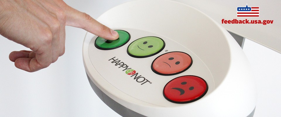
Feedback USA is adding customer satisfaction kiosks to government customer service locations, beginning with the Social Security Administration (SSA) card centers, the State Department’s passport centers, Transportation Security Administration (TSA) airport security checkpoints, and the Department of Veterans Affairs (VA). These agencies were chosen to kick off the pilot because, as explained by Vicki McFadden, Deputy Customer Officer at the GSA, they are “really focused on improving customer service” and are “where citizens are constantly interacting with government.”
There’s a lot to like about the Feedback USA pilot. There are also a few potential issues that might raise some questions. Let’s take a look at both:
What to like in Feedback USA
Giving feedback is easy. All it takes is the tap of a button. If someone wants to provide additional details on an agency’s website, they’re welcome to, but it’s entirely optional.
The feedback is real-time. Learning about a problem right when it’s happening can give agencies a chance to fix it before it blooms into disaster. Done right, this proactive approach can support same-day customer service improvements. Whether this real-time feedback works or not will depend on how aggressive agencies are in taking action on the data they’re given.
The kiosks provide anonymity. Rather than being required to provide personal information on a government form or turn over data by installing an app, the kiosks let people share without added paranoia. And, unlike reviewing government feedback on Yelp or social media, the data isn’t publicly displayed online and connected to your profile (and ego).
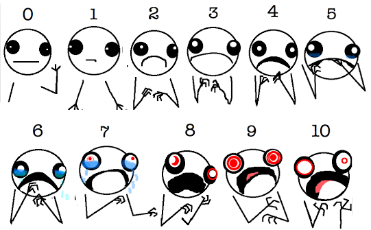
The kiosk faces overcome language barriers. By using wordless emojis, people with reading disabilities, language impairments, and others who have difficulty expressing themselves through the written word (like some older adults) can share how they feel. It’s similar to the medical Faces Pain Scale, which we can’t include here because of overly-restrictive rules, so here’s Hyperbole and a Half‘s funnier, better pain scale:

This feedback system is more accessible to the digitally unconnected. Feedback systems on websites and apps require people to have access to and comfort using digital tools. Given that the digital divide in the U.S. is still all too real and perhaps widening, providing people with a non-digital option means more people have access to sharing feedback.
The squeaky wheel won’t get the grease. People are are more willing to use burdensome tools when they have something to either rant or rave about, but not as much for those uneventful and satisfactory experiences in between. Since they’re more burdensome, the other government feedback tools—like surveys, social media, and complaint forms—may be dominated by extreme views. When giving feedback is easy and data is collected at a massive scale, the information is potentially more balanced.
What’s (possibly) missing from Feedback USA
Feedback USA’s good intentions are not in doubt. Since the pilot has just begun, these issues may be addressed during the evaluation process. Some of the issues are a matter of the limitations of collecting transactional data at massive scale. Some are related to the kiosk service, for which independent research into its effectiveness is not readily available.
Don’t see this as poking holes, but rather as opportunities for government to excel at at customer service satisfaction.
No neutral option. Research into face pain ranking systems and satisfaction scales has shown that not offering a neutral choice can skew ratings to either extreme or create bias. Colors, nuances in the face design, and the number of choices can also affect feedback quality and consistency. Such complexities and potential for bias in visual ranking systems raises a question of whether the kiosk design is optimized for the government service context.
Reliance on visual cues excludes some groups. For the estimated 3.5 million people in the U.S. who have autism and for people who are visually impaired, a face scale may not allow them to effectively communicate their feelings. People can instead provide feedback online, but that process is more difficult and is limited by other barriers to participation.
Smiley faces aren’t all that actionable. Sure, you can collect a lot of data if it’s as easy as pushing a button. But, all you’ll have is one indicator of how someone approximately feels, but not why they feel that way. Feedback data needs context, and that seems missing from the Feedback USA approach. Since the kiosks don’t have a way to provide more specifics there and then, that means the real cause of a problem—and the most appropriate solution—might be left to guesswork.
People may never learn if their problem has been resolved. Feedback is most effective when it’s not a one-way conversation. Feedback USA collects customer input, but it’s only output seems to be potential operational changes at agencies. What’s missing is the critical relationships and conversations with government’s customers. For example, even something as simple as thanking people for their feedback after a few day’s delay can significantly improve their feelings about what they reviewed.
The kiosks gather data at the moment of strongest emotion. People going into a government office may see it as a chore, an obligation, or even a mind-numbing inconvenience. The surroundings may be perceived as stressful, impersonal, or downright intimidating. This negativity can magnify the smallest of inconveniences into The Worst Day Ever. Feedback given in that moment could be based on reaction, rather than reflection. Hopefully, Feedback USA and participating government agencies will also test ways of incorporating followup and conversation into this customer service system.
What are your thoughts about Feedback USA? Could it help your agency improve its customer service experience?
Lauren Girardin is a marketing and communications consultant, writer, and trainer. Find her on Twitter at @girardinl.


Great post, Lauren! Providing analysis for both sides of the argument is insightful! I would imagine gov feedback programs will have to take an iterative approach and I am curious to see how these programs change over time. I very much agree with your observation that “smiley faces aren’t that actionable.” As you say, without context, the feedback can’t drive much action or problem solving.
I’m so glad you liked it. Thanks, Leah.
Cool! I saw these at an airport on a recent trip (can’t remember which airport). They were placed just after the security screening stations, asking how the screening process went. Of course I answered! It went fine for me, but then again, I always get to the airport in plenty of time, so the lines aren’t that much of a problem for me. Someone who is late would have had a different opinion — if they took the time to answer at all! So I can see the argument about it being too simple, and not providing the ‘why’ for negative (or positive, for that matter) responses.
That’s a great point that someone who is pressed for time may not bother to answer. Soliciting people’s opinions at the right place and time is important to getting accurate feedback.