The following post is an excerpt from GovLoop’s recent guide, Defining Your Role in Government Customer Service. In it we offer practical tips to engrain a culture of service into your agency’s daily routines. Download the full guide here.
A roundtable discussion with Jennifer Piozia, Director of External Communications, Office of Strategic Communications and Public Affairs, Transportation Security Administration (TSA), and Blair Corcoran de Castillo, Design Strategist, Lab, Office of Personnel Management (OPM)
USAJOBS Gets a Revamp
The Problem: Ranked one of the worst customer services across industries, the USAJOBS website portal user experience often deters eligible candidates from successfully applying to federal jobs.
The Solution: OPM’s Lab applied human-centered design (HCD) concepts to revitalize the USAJOBS portal. HCD is a structured approach to infusing the customer – in this case, potential applicants – into every part of a service’s development and delivery.
To execute the revision, Corcoran de Castillo’s team started by mapping the journey users take to apply through the portal. This mapping exercise is critical to understanding user experience.
Corcoran de Castillo described CX as “every touchpoint in a customer journey in interacting with an agency, organization, project or service.” But she said that many people misinterpret that to mean experiences start when someone walks into an agency or logs into a website.
In reality, the customer journey starts much earlier – when the citizen starts to think about using a service. “Think about Starbucks. Your first touchpoint isn’t when you walk into the store; it’s when you decide you need a caffeine boost,” Corcoran de Castillo said.
To understand the full scope of a customer’s journey on USAJOBS, her team talked to the people who have used, or might in the future use the service. “We did hundreds of interviews with federal employees, veterans and people interested in federal appointment. We asked them what they wanted from the website,” she said. “What we heard is that they felt there weren’t any help services to navigate the website and application process.”
Those findings surprised the team, because the website already hosted a variety of support options for applicants. Corcoran de Castillo admitted, “Hearing that, it’s a natural reaction just to say they already exist and blame the user. But in human-centered design, you have to listen to what the user is telling you.”
In this case, users were making it clear that current support services weren’t intuitive or accessible. To remedy that problem, the Lab created a central help center that combined all the disparate resources available to potential candidates.
They also invested in a social media strategy, where users could ask questions and receive answers on pertinent applications and vacancies. This latter improvement was made after learning in interviews that many applicants were looking at those channels for information, rather than federal websites.
Today, the USAJOBS experience is on the upswing. Help desk tickets have dramatically declined, and the Lab is continuing to meet with potential users to learn where further improvements can be made.
TSA Takes Questions
The Problem: An agency created in reaction to 9/11 and staffed with remarkable speed, TSA wasn’t designed to provide customer service. But today, more than half of all Americans have to interact with the agency to travel.
The Solution: By 2015, it was apparent that public perception of TSA was a problem. For many years, the agency worked in reactive mode and accepted disgruntled passengers as routine. “Even if we do our job perfectly, there will still be people unhappy with that process of inspection and screening,” Piozia said.
What the agency realized over time, however, was that unprepared and disgruntled passengers had implications for operations and employee morale. Screening lines were long, officers were dedicating significant time to avoidable incidents, and security costs were on the rise.
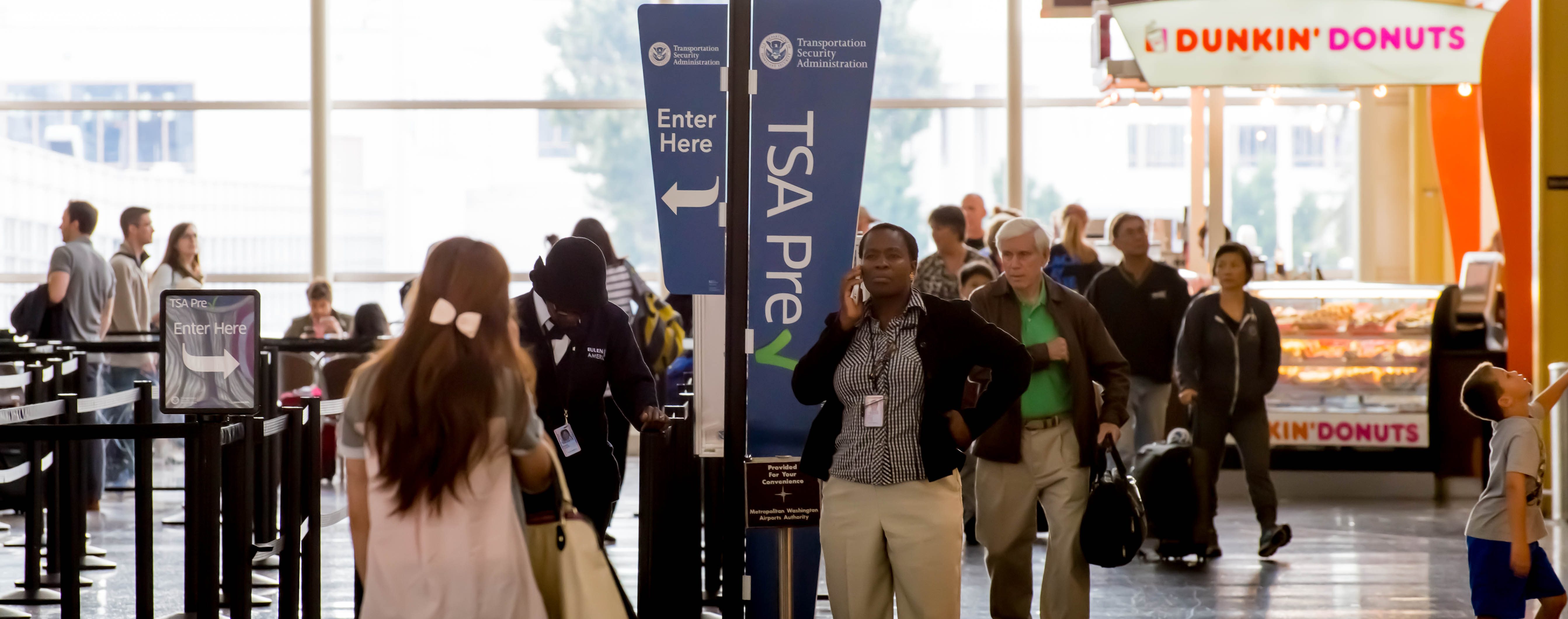
But instead of taking an operations-focused approach to this problem, TSA focused on the customer. In September 2015, it began a multifaceted campaign to improve customer experience across TSA’s many touchpoints, including online and at airports.
The most-used service that also receives significant publicity is “AskTSA.” Via multiple social media platforms, passengers can ask the agency any question about air travel. The most common question is what items can be carried aboard an aircraft, but the service will navigate users to the answer of almost any question within 15 minutes.
The program started as a pilot, staffed with 10 temporary personnel on details from other agencies. But it’s quickly become a permanent fixture of the agency. Piozia said the program really gained momentum “once our agency saw the success of how we could get ahead of small problems before they became big problems.”
By informing passengers about operating procedures before they enter the security screening line, TSA has been able to decrease wait times while improving customer satisfaction. Additionally, the service can solve problems – like forgetting to mark TSA PreCheck on a boarding pass – before it impacts a customer’s travel.
“More than any press release or interview I’ve set up for the agency, I feel like this program has allowed me to help citizens,” Piozia said.
To date, the AskTSA program has responded to over 330,000 inquiries with an average response time of 20 minutes. Demand is only growing. In fact, the now 15-person team has witnessed a 179 percent increase in volume since January 2016 alone.


Leave a Reply
You must be logged in to post a comment.