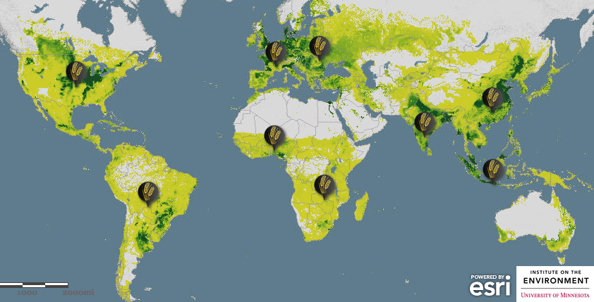
While at the “Designing Great Maps for Web and Mobile” session at the Esri Federal GIS Conference, the importance of color as a tool to engage non-GIS users in maps and stories was a highlight of the discussion. Different colors can be used to make certain elements stand out while too many colors can cause confusion for the viewer.
During the presentation, former chief cartographer at National Geographic and current manager for storytelling at Esri, Allen Carroll, described great maps as those that can:
- Connect with the audience: Use striking colors in areas that are important and resonate with the reader
- Limit user options: Great maps do ONE thing really well
- User experiences support the story: Think about the job your map is doing and exemplify the means by which users will experience that story
- Easy to read: Using one color throughout can be helpful in some cases to not distract from the content
- Strive for simplicity: Reduce the number of elements to focus on the most critical portions and eliminate unnecessary information
One of the ways that this is possible is through using the right color scheme. For simplicity and making them easier to read, it is essential to maintain one shade throughout as to not distract the viewer from the content. Carroll also warned of color combinations that send strong subliminal messages such as red and green representing Christmas or red, white, and blue associating with the American flag.
At the end of the session, an attendee asked what tools are available for those who are colorblind and interact with maps regularly. After further investigation, I discovered that the majority of color schemes already provided on Online/Smart and Pro Mapping are professionally designed to avoid any observing issues for those with colorblindness.
However, when a GIS user starts to generate their own colors, the map will maintain its function, but could potentially get confusing for colorblind viewers. For example, a person that is colorblind may not see all hues and a map that displays two completely different items may look the same overall color.
Colors are more important than an average person might think. However, for GIS users, colors increase the efficiency and effectiveness of a map. The session ended with a map on “Feeding the world: Can global crop production meet future demands?” Carroll explained that when maps follow his rules and use color as an enhancement tool, policymakers will answer these questions and create life-changing policy. Next time you are portraying data that you hope will spark meaningful policy decisions, think about how you will manipulate colors to get your point across.
