Data Visualization: Make Them See What You’re Saying
Data-driven decision-making improves effectiveness and efficiency, increases transparency, and enables agencies to be more proactive. But raw data alone rarely inspires action.


Data-driven decision-making improves effectiveness and efficiency, increases transparency, and enables agencies to be more proactive. But raw data alone rarely inspires action.

Data visualizations are crucial to sharing the results of quantitative work. Ideally, they should help your audience understand your findings quicker, like a power-assisted bicycle. However, most of us are not trained in data visualization best practices and it can be difficult to know what type of chart to choose.

Data visualization helps people understand and use data more effectively. Here are some pointers for doing it right.

There’s nothing more transparent than raw data. But that’s not accessible to people. That’s where data visualization comes in. Increasingly, users expect data to be something they can see, not just read.

In a recent survey conducted by Forrester Consulting and Tableau, 60% of respondents said they did not have the data skills they were expected to have for their jobs.

The AWS partner network is helping government agencies facilitate data sharing and analytics to support crisis management efforts.

“Treasury sits in some ways in the center of the federal government because we’re the financial managers for the rest of the government,” said Justin Marsico, Deputy Assistant Commissioner and Data Executive at Treasury’s Bureau of the Fiscal Service. “And at the heart of that financial management activity is data.”

Your Guide to America’s Finances is an overview of federal government finances in 2018, providing information on spending, revenue, the deficit, and the debt.
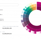
A new data visualization and analytics site from USAspending.gov showcases different ways government spending data can be presented.
One of the mistakes people make is that the data steals the show, and it is left to tell its own story. Don’t fall victim to that trap. Check out these practical tips for leading data-drive briefings.